Using whotracks.me data and sankey diagrams to dissect trackers
In this post we'll try to do two things:
When building the tracker maps that you see on popular site profiles on whotracks.me, sankey diagrams seemed like a good fit to map categories of tracking to companies that own the trackers. Each link would be a tracker, going from a category to a company.
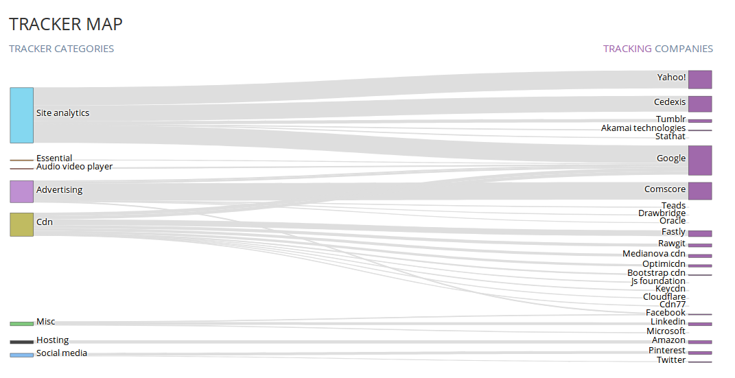
Figure 1: Sankey diagram used to represent a tracker map
Sankey diagrams are great at visualizing flow volume metrics. Sometimes they are found under the name alluvial diagrams, although they originally are different types of flow diagrams [1].
We wanted to use the sankey diagram supported in plotly [2], the visualisation
library of choice used in whotracks.me. The function itself is pretty simple,
as you will see in a bit when we define sankey_diagram(). The challenge to creating
sankey diagrams with Plotly is understanding the required structure of the input data
required by the plotting function. Hopefully the following example will
make it easier for those reading this post, should they ever decide to try
sankey diagrams.
The goal here is to show a very small dataset, structured in a way that the plotly diagram (and other plotting solutions e.g.: d3.js) understand. We will be mapping cities to the countries they are part of. The value of each link, will be the city population (in millions).
city_data = dict(
        nodes = dict(
            label=["Germany", "Berlin", "Munich", "Cologne", "France",  "Paris", "Lyon",  "Bordeaux"],
            color=["beige",   "black",  "red",    "yellow",   "beige",  "blue",  "white", "red"]
        ),
        links = dict(
            source=[0, 0, 0, 4, 4, 4],
            target=[1, 2, 3, 5, 6, 7],
            value= [3.5, 1.5, 1, 2.2, 0.5, 0.2],
            label=["capital", "city", "city",   "capital", "city",  "city"],
            color=["black",   "red",  "yellow", "blue",    "whitesmoke", "red"]
        )
    )
Note how there are two keys in the dictionary, nodes and links, and each has some
attributes. Let's go over them. Each node has a label (e.g. Germany) and a corresponding
color (in this case beige). Note that labels and colors are stored in lists of
equal length, and the pairing is done based on equality of that index.
Links contain information about how to link nodes. Each has a source, target, value,
label and color. Source contains the index in the list of the source node,
whereas target the index in the list of the target node.
Value determines how thick the link should be (in our case it will be
the population of each link, hence each city), Label and color, as the
name suggests, specify the label and color of the link. Links too, are
paired based on index.
Now let's write a simple function to plot this data nicely. Most of the work has already been done, given we're feeding the data in a format that's easy to parse.
from plotly.offline import iplot

def sankey_diagram(sndata, title):
    # First part of a plotly plot is the `trace`
    data_trace = dict(
        type='sankey',
        node=dict(
            pad=10,
            thickness=30,
            # label could easily be equal to sndatap['node]['label']. The following is just cosmetics
            label=list(map(lambda x: x.replace("_", " ").capitalize(), sndata['nodes']['label'])),
            color=sndata['nodes']['color']
        ),
        link=sndata["links"],

        # configuration options for the diagram
        domain=dict(
            x=[0, 1],
            y=[0, 1]
        ),
        hoverinfo="none",
        orientation="h"
    )
    # Second part of a plotly plot is the `layout`
    layout = dict(
        title=title,
        font=dict(
            size=12
        )
    )
    fig = dict(data=[data_trace], layout=layout)
    return iplot(fig)
All that is left now, is feeding the city_data to the sankey_diagram function
and we're done.
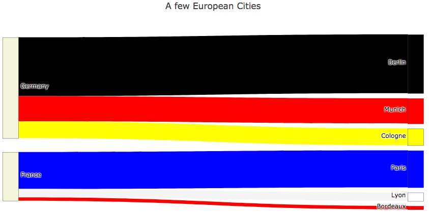
Figure 1: Simple example of a sankey digram for cities
Trying to create the flags of these countries did not end up being such an aesthetically good idea.
Doing Sankey diagrams for cities may have been fun. The result of doing the same for trackers on your favourite sites might not be as fun -it may in fact be terrifying. We'll be using public data from whotracks.me to map tracker categories to companies present on a particular site. Each link will be a tracker the company owns. This gives immediate visual insights on who's watching you and why.
The data and API for whotracksme us available on Pypi and you can easily install it
running pip install whotracksme.
from whotracksme.data.loader import DataSource
from whotracksme.website.plotting.colors import tracker_categoryColors, cliqz_colors
DataSource is a class that provides access to trackers, companies that own them, and popular websites. The functionality of DataSource is something we'll be constantly trying to improve and expand. Online tracking is messy enough to analyze, so at least the tooling should be as simple as possible.
We will be looking at Reddit. If you are not familiar with Reddit,
check it out - there are some great communities there. Now we'll look at the tracking
landscape in reddit. To do that, we only need to know the reddit site_id,
which is reddit.com. Each site has a site_id, most often its url.
Here we will be mapping companies and the trackers they operate to the category of the tracker. The thickness of the link is a function of the frequency of appearance of the tracker per page load in the given domain.
def sankey_data(site_id, data_source):

    nodes = []
    link_source = []
    link_target = []
    link_value = []
    link_label = []

    for (tracker, category, company) in data_source.sites.trackers_on_site(site_id, data_source.trackers, data_source.companies):

        # index of this category in nodes
        if category in nodes:
            cat_idx = nodes.index(category)
        else:
            nodes.append(category)
            cat_idx = len(nodes) - 1

        # index of this company in nodes
        if company in nodes:
            com_idx = nodes.index(company)
        else:
            nodes.append(company)
            com_idx = len(nodes) - 1

        link_source.append(cat_idx)
        link_target.append(com_idx)
        link_label.append(tracker["name"])
        link_value.append(100.0 * tracker["frequency"])

    label_colors = [tracker_categoryColors[l] if l in tracker_category_colors else cliqz_colors["purple"] for l in nodes]

    return dict(
        nodes = dict(
            label=nodes,
            color=label_colors
        ),
        links = dict(
            source=link_source,
            target=link_target,
            value=link_value,
            label=link_label,
            color=["#dedede"] * len(link_label)
        )
    )
Now that we have a function to generate the data in the format we need it, let's run it for reddit and plot the sankey diagram to investigate the tracking landscape:
input_data = sankey_data('reddit.com', data_source=DataSource())
sankey_diagram(input_data, 'Tracker Map on reddit.com')
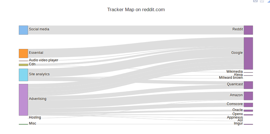
Figure 1: Tracking landscape on reddit.com
We see that most tracking happens for advertising reasons. Although it does not seem like it, Reddit is keeping the set of advertisers they expose their users somwhat limited compared to other portals and news sites. In terms of number of trackers, Google has the most eyes on reddit users. For more details on the tracking landscape on reddit, head over to reddit's profile page on whotracks.me.
[1] Sankey Diagrams - Wikipedia
[2] Plotly - Python Graphing Library
[3] Jupyter Notebook on this post